Responsive vs. Adaptive Web Design: Understanding the Key Differences
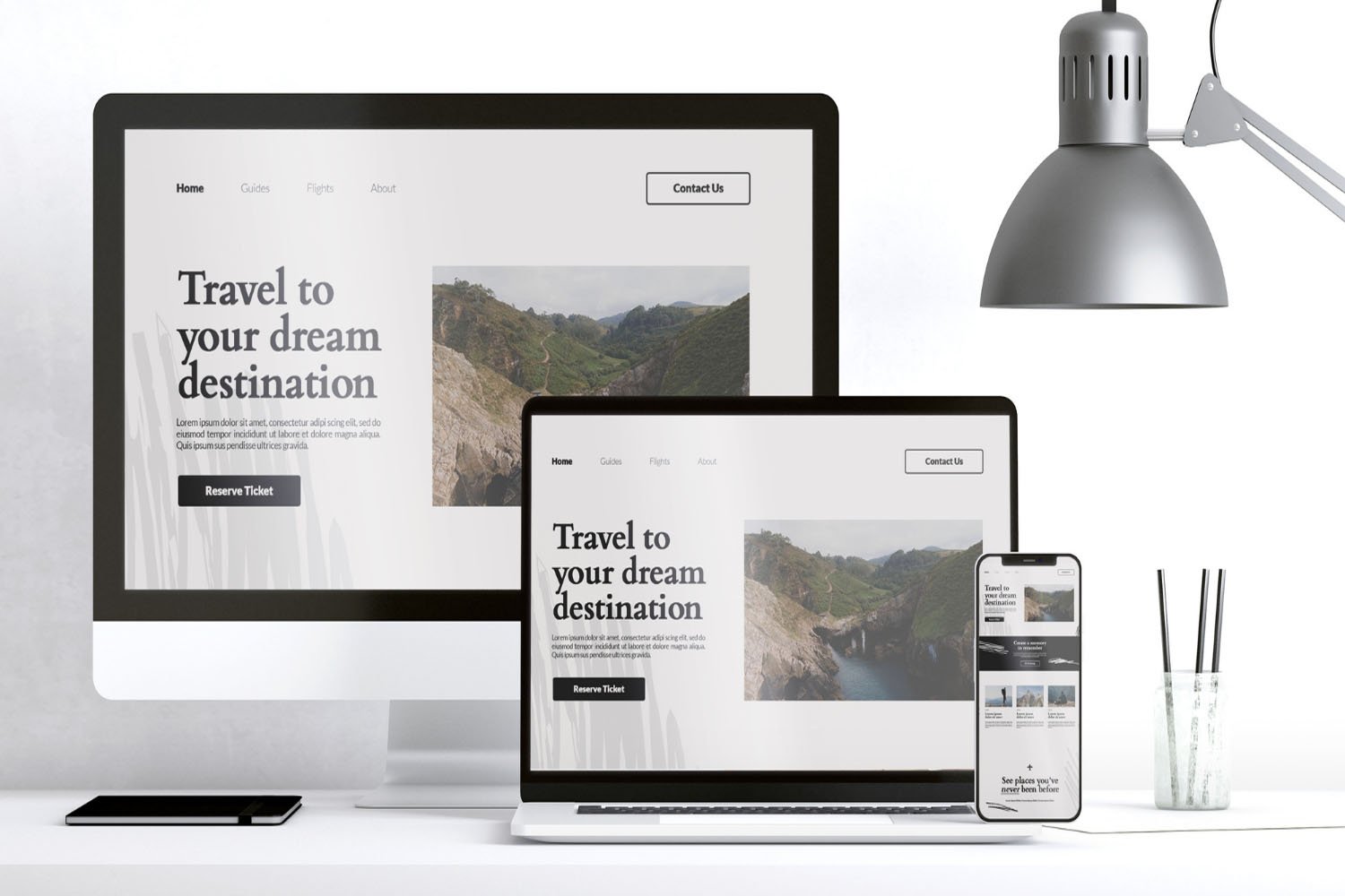
Understanding the Basics: What is Responsive Web Design?
Definition of Responsive Web Design
Responsive Web Design (RWD) is a design approach aimed at crafting websites to provide an optimal viewing experience across a wide range of devices, from desktop monitors to mobile phones. This approach involves flexible layouts, images, and cascading style sheet (CSS) media queries.
How Responsive Design Works
Responsive design functions by using fluid grids, where page elements are sized by proportion, rather than pixels. Media queries are used in CSS to change styles based on the characteristics of the device rendering the site, such as width, height, or orientation.
Key Characteristics of Responsive Web Design
The main characteristics of responsive design include fluid grids, flexible images, and media queries. These allow the layout to adapt to various screen sizes and resolutions, ensuring consistency in user experience regardless of the device.

Delving Deeper: What is Adaptive Web Design?
Defining Adaptive Web Design
Adaptive Web Design (AWD) is a methodology where a website has multiple distinct layouts, which are deployed based on the detected screen size of the device. Unlike responsive design, which is fluid and flexible, adaptive design selects a layout most suitable for the device.
Mechanisms Behind Adaptive Design
Adaptive design relies on predefined screen sizes. It detects the device’s screen size and loads the appropriate layout for it. This can involve serving different HTML and CSS code to different devices based on the screen size.
Fundamental Features of Adaptive Web Design
Key features of adaptive design include predefined layouts for specific screen sizes, potentially faster load times on mobile devices since resources are tailored for each layout, and the ability to fine-tune designs for specific devices and resolutions.
Responsive vs. Adaptive Design: A Detailed Comparison
Design Approach and Flexibility
Responsive design is fluid and flexible, automatically adjusting to the screen size. In contrast, adaptive design is more rigid, using predefined layouts for specific screen sizes.
Layout and User Experience
In responsive design, the same content is rearranged to fit different screens, maintaining a consistent user experience. Adaptive design, however, can provide a more tailored experience as layouts are specifically designed for certain devices.
Technical Implementation and Complexity
Responsive design can be more complex to implement due to the need for fluid grids and flexible content. Adaptive design, on the other hand, involves creating multiple layouts, which can be more straightforward but requires additional planning and design time.
Evaluating the Pros and Cons of Responsive Web Design
Advantages of Responsive Design
Responsive Web Design offers significant benefits, primarily its fluid nature which ensures a consistent user experience across various devices and screen sizes. This adaptability enhances user engagement and retention. Additionally, it simplifies website management as there is only one layout to maintain, and it’s beneficial for SEO since search engines like Google prioritize mobile-friendly websites.
Challenges and Limitations
Despite its advantages, Responsive Design comes with challenges. Implementing a fully responsive design can be complex and time-consuming, requiring detailed attention to ensure consistency in performance across all devices. It may also lead to longer loading times on mobile devices if not optimized properly, due to the same resources being loaded regardless of the device.
Ideal Use Cases for Responsive Design
Responsive Design is particularly well-suited for websites where uniformity in content across devices is crucial. It’s ideal for content-driven sites like blogs, news portals, and corporate websites where the primary goal is information dissemination.

Weighing the Advantages and Disadvantages of Adaptive Design
Benefits of Adaptive Design
Adaptive Design stands out for its ability to provide tailored experiences for different devices. It can optimize performance by loading only the necessary resources for each specific layout. This approach allows for finely tuned designs that can cater to the unique features of different devices, potentially offering a more intuitive user experience.
Drawbacks and Considerations
The primary drawback of Adaptive Design lies in its complexity and resource requirements. Creating multiple layouts for various devices means more work in design, development, and maintenance. There’s also a risk of inconsistency in user experience across devices, and it can be less flexible in accommodating new screen sizes and devices.
Scenarios Where Adaptive Design is Preferable
Adaptive Design is often the choice for complex web applications or e-commerce sites where user experience needs to be highly optimized for different devices. This approach is beneficial when the user interactions vary significantly between desktop and mobile versions.
Deciding When to Use Adaptive or Responsive Design
Factors Influencing the Choice
The decision between Adaptive and Responsive Design depends on various factors including the project’s budget, timeline, and the technical skills available. The complexity of the website and the specific needs of the user base also play a significant role.
Audience and Device Considerations
Understanding the target audience and their primary devices is crucial. If the audience predominantly uses mobile devices, a responsive approach might be more appropriate. Conversely, if the website requires complex, device-specific functionality, adaptive design could be the better choice.
Business and Branding Implications
From a business perspective, the choice impacts brand perception, customer satisfaction, and ultimately, the bottom line. A well-executed design, whether responsive or adaptive, can enhance brand image and drive engagement. The decision should align with the broader business strategy and branding efforts.
Making an Informed Decision: Choosing Between Adaptive and Responsive Web Design
Analyzing Your Specific Needs
When deciding between adaptive and responsive web design, the foremost consideration should be the specific needs of your project. This involves assessing the type of content you’ll display, the expected user behavior, and the goals of your website. For example, if your site needs to provide a highly customized user experience across various devices, adaptive design might be more suitable. Conversely, for a more uniform and content-centric site, responsive design could be a better fit.
Cost and Resource Evaluation
The choice between adaptive and responsive design significantly hinges on the budget and resources available. Responsive design, while initially more complex, often requires less maintenance in the long run, making it a cost-effective solution. On the other hand, adaptive design might entail higher upfront development costs due to the need for multiple layouts, but it can offer performance advantages, particularly for sites with heavy traffic or complex functionality.
Future-Proofing Your Website Design
An important aspect of choosing a web design approach is considering how it will stand the test of time. Responsive design is generally considered more future-proof as it automatically adjusts to new screen sizes and devices. This makes it a practical choice in an era where new devices are constantly being introduced. Adaptive design, while tailored to current devices, may require updates and adjustments as new technologies emerge.

Essential Takeaways and Key Considerations
Summary of Key Points
In summary, both adaptive and responsive designs have their unique strengths and challenges. Responsive design is lauded for its flexibility and ability to provide a consistent user experience across different devices. Adaptive design, however, offers more customization for specific devices, potentially enhancing performance and user experience. The choice depends on various factors, including the purpose of the site, the target audience, budget constraints, and long-term maintenance considerations.
Final Thoughts on Adaptive and Responsive Design
In the ever-evolving landscape of web design, both responsive and adaptive approaches offer viable paths to creating effective and user-friendly websites. The decision should be guided by a thorough understanding of your audience’s needs, your business objectives, and the technological landscape. It’s not just about following trends but about making a strategic choice that aligns with your long-term goals.
Additional Resources and Further Reading
For those looking to delve deeper into this topic, a wealth of resources is available. Online web development communities, comprehensive guides on web design, and case studies comparing adaptive and responsive designs can provide further insights. Staying informed about the latest developments in web technology and design philosophies will also aid in making a well-informed decision that benefits your website in the long run.

As a seasoned professional with a unique blend of skills in Computer Design and Digital Marketing, I bring a comprehensive perspective to the digital landscape. Holding degrees in both Computer Science and Marketing, I excel in creating visually appealing and user-friendly designs while strategically promoting them in the digital world.