What is the Purpose of Responsive Web Design?
Understanding Responsive Web Design: Its Goals and Importance
What is The Purpose of Responsive Web Design?
Responsive web design (RWD) has revolutionized how we interact with the digital world. In an era where the variety of device sizes is constantly expanding – from smartphones and tablets to desktops and large screens – RWD ensures a seamless and consistent user experience. The core purpose of RWD is to create web pages that detect the visitor’s screen size and orientation, then change the layout accordingly. This approach guarantees that a site is accessible and functional, regardless of how the audience accesses it.
The Essentials of Web Design: A Comprehensive Overview
Web design is the art and science of creating websites. It encompasses several different aspects, including webpage layout, content production, and graphic design. While the terms web design and web development are often used interchangeably, web design is technically a subset of the broader category of web development. It’s not just about making a site look attractive; effective web design ensures a site is user-friendly, aesthetically pleasing, and suits the user group and brand of the website.
Decoding Responsive Web Design: What Does It Really Mean?
Responsive web design is a methodology where the design and development of a website should respond to the user’s behavior and environment based on screen size, platform, and orientation. The practice consists of a mix of flexible grids and layouts, images, and an intelligent use of CSS media queries. When a user switches from their laptop to an iPad, the website should automatically switch to accommodate for resolution, image size, and scripting abilities. In other words, the website should have the technology to automatically respond to the user’s preferences.
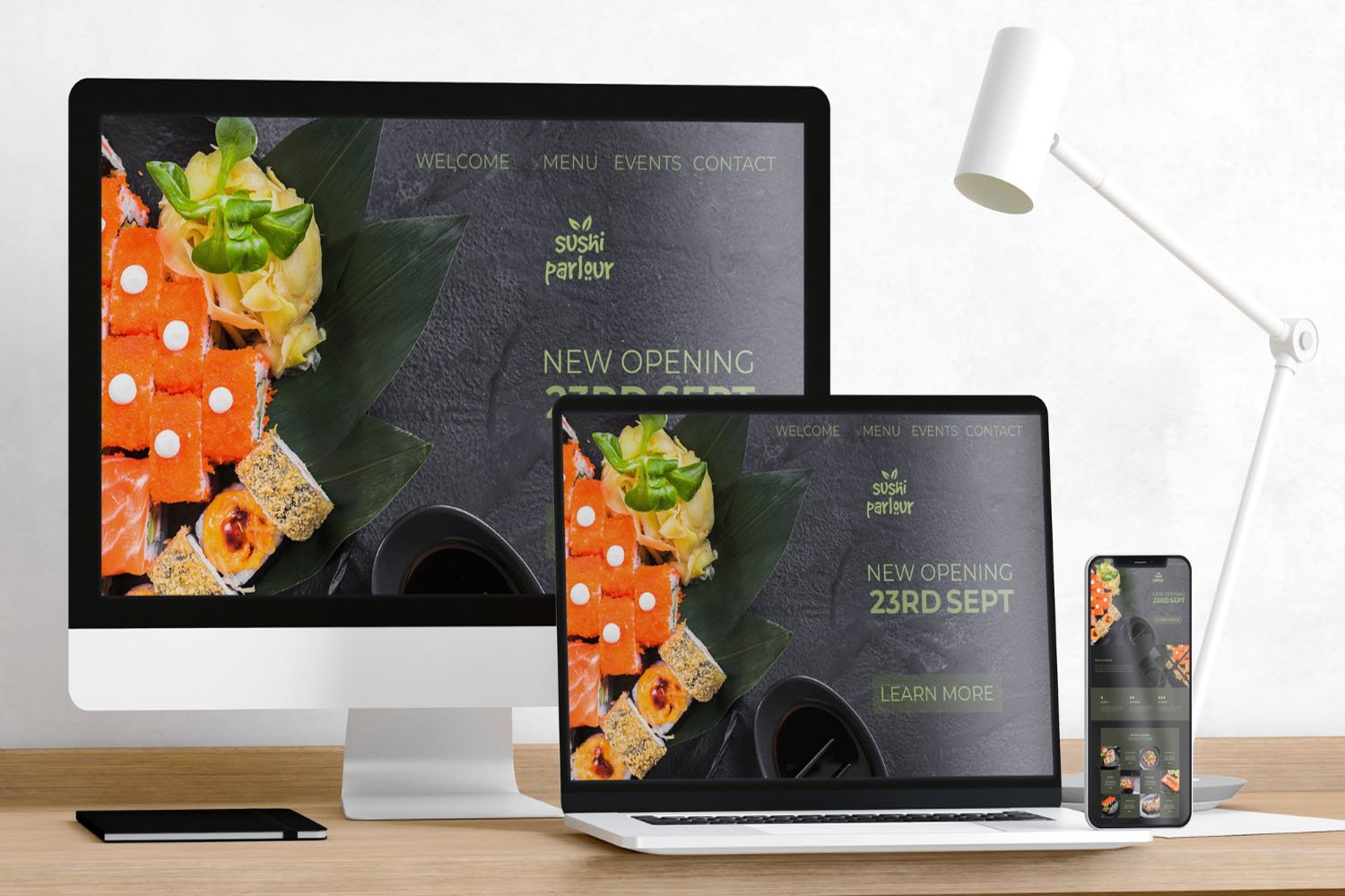
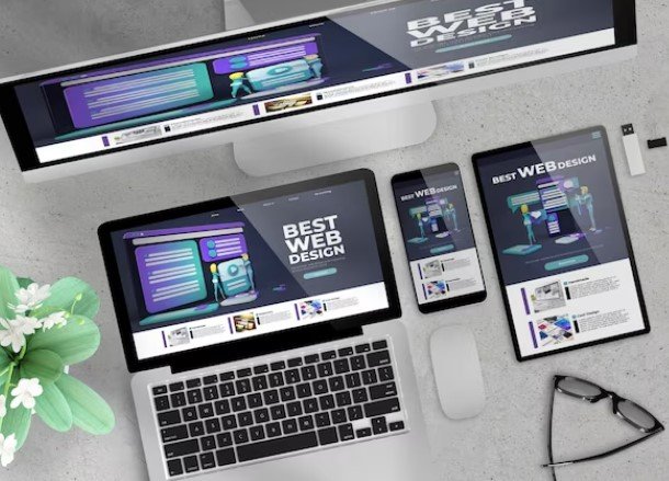
Showcasing Flexibility: A Look at Responsive Design in Action
Responsive Design Examples
To understand responsive design in action, consider a website that adapts its layout depending on the screen size. For example, on a desktop, a website might display content in multiple columns, but on a mobile device, it shifts to a single-column layout. This flexibility not only enhances user experience but also caters to the varying screen sizes of modern devices. Another example could be the resizing of images to fit different resolutions or the transformation of menus into more mobile-friendly versions.
Responsive vs. Traditional: Unraveling the Differences in Web Design
The key difference between responsive and traditional web design lies in adaptability. Traditional web design often involves creating a separate mobile version of a website, while responsive design uses the same code and content but adjusts the layout based on the screen size. This not only simplifies web maintenance but also ensures a consistent user experience across devices.
Exploring the Varieties: Diverse Approaches in Responsive Web Design
Responsive web design isn’t a one-size-fits-all approach. It includes various techniques like fluid grid layouts where elements resize in relation to the screen, flexible images that scale within context, and media queries that apply different CSS styles based on device characteristics. The combination of these techniques allows designers to create responsive websites that look and work well on any device.
Adapting to Mobile: The Role of Fluid Layouts in Responsive Design
The adaptation of web design to mobile devices is a cornerstone of responsive design. Fluid layouts are crucial in this context. Unlike fixed layouts with rigid structures, fluid layouts use relative units like percentages, allowing elements to resize and shift depending on the screen size. This adaptability ensures that whether a user is on a desktop, tablet, or smartphone, the website maintains usability and aesthetic integrity, providing a consistent experience across all devices.
Interactivity in Focus: The Use of Hover Effects and Animations in Responsive Design
Responsive design isn’t just about adapting structures; it’s also about enhancing interactivity. The use of hover effects and animations can significantly improve user engagement and experience. For instance, hover effects can reveal additional information or indicate clickable elements, while animations can guide users through the site, creating a more dynamic interaction. These elements must be thoughtfully implemented to ensure they enhance, rather than hinder, the user experience, especially on devices that don’t support hover functionality, like touchscreens.
Navigational Ease: The Trend of Floating Menus in Responsive Web Design
A floating menu, or sticky navigation, is a tool in responsive design that enhances user navigation. Unlike traditional menus that disappear as the user scrolls down, floating menus remain visible, providing constant, easy access to navigation, regardless of where the user is on the page. This feature is especially useful on mobile devices, where screen space is limited, and users might need to scroll through long pages.
Integrating Video Content: Enhancing User Experience in Responsive Web Design
Incorporating video content into responsive web design is a strategy to enhance user engagement and provide richer content. Videos must be responsive too, meaning they should adapt to different screen sizes without losing quality or causing layout issues. This integration ensures that users have a seamless experience, whether they’re viewing content on a large desktop screen or a small smartphone.
The Rationale Behind Responsive Web Design: Why Adaptability Matters
The core rationale behind responsive web design is adaptability. In an age where users access the internet from a plethora of devices, responsive design ensures that a website is functional and aesthetically pleasing on any device. This adaptability improves user experience, increases the time users spend on a site, and potentially boosts conversion rates and customer loyalty.
Personalizing the Web: An Insight into Custom Web Design
Custom web design refers to the process of creating a website specifically tailored to the unique needs and aesthetic of a business or individual. Unlike template-based designs, custom design involves building a site from scratch, with bespoke features and elements that align closely with the client’s vision and objectives. This approach allows for greater flexibility and uniqueness in web design.
Advantages of Tailored Web Solutions: Benefits of Custom Web Design
Custom web design offers several advantages. It allows for a unique digital presence that stands out from the competition, aligns perfectly with a brand’s identity, and caters specifically to the target audience’s preferences. Custom designs are often more scalable and adaptable to changing needs, potentially offering better performance and a more seamless user experience. They also tend to have better SEO performance, as they are tailored not just to users but also to the specific requirements of search engines.
Bespoke Digital Experiences: Crafting Websites to Your Exact Needs
Understanding the Value of Tailored Web Solutions
In this section, the focus is on the unique benefits that custom web design offers, emphasizing how tailored solutions can meet specific business or personal needs. This includes a discussion on the importance of aligning web design with brand identity, user experience, and functional requirements.
The Process of Creating Customized Websites
This part delves into the step-by-step process of developing a bespoke website. It covers aspects such as initial consultations, design conceptualization, iterative development, and the incorporation of unique features and functionalities that standard templates cannot provide.

Unique Digital Identities: The Exclusivity of Custom Web Design
Standing Out in the Digital Space
Here, the emphasis is on how custom web design enables businesses and individuals to distinguish themselves in an increasingly crowded digital landscape. The section highlights the role of unique design elements in creating an exclusive online identity.
The Role of Creativity and Innovation in Web Design
This subsection explores the importance of creative freedom and innovation in custom web design. It discusses how designers and clients can collaborate to push boundaries and create unique, memorable web experiences.
Optimizing for Efficiency: How Custom Design Leads to Faster Web Performance
Balancing Aesthetics with Performance
This section addresses how custom web design can be optimized for speed and efficiency without compromising on aesthetics. It explores techniques for creating visually appealing designs that are also fast and responsive.
Technical Strategies for Enhanced Performance
In this part, the focus is on the technical aspects of web design that contribute to faster website performance. Topics might include optimized coding practices, efficient use of resources, and the integration of advanced technologies.
Faster Performance
The Impact of Speed on User Experience and SEO
This section examines how website performance directly affects user experience and search engine optimization (SEO). It discusses the importance of fast loading times in retaining visitors and improving search rankings.
Advanced Techniques for Boosting Website Speed
Here, the discussion centers on specific methods and techniques used in custom web design to enhance website speed. This might include topics like advanced caching techniques, image optimization, and the use of content delivery networks (CDNs).
Conclusion
In conclusion, custom web design offers unparalleled benefits in creating unique digital identities, optimizing for efficiency, and enhancing user experience. By focusing on tailored solutions, businesses can stand out in the digital landscape and ensure their websites are not only visually appealing but also perform optimally. The blend of creativity, technical prowess, and strategic design in custom web development paves the way for a more engaging, distinctive, and efficient online presence.

As a seasoned professional with a unique blend of skills in Computer Design and Digital Marketing, I bring a comprehensive perspective to the digital landscape. Holding degrees in both Computer Science and Marketing, I excel in creating visually appealing and user-friendly designs while strategically promoting them in the digital world.