
Do Websites in Color Get More Followers?
Introduction
In the realm of web design and online marketing, the influence of a website’s color scheme on its follower count and engagement is a topic of both intrigue and practical significance. The core question at hand is: Does the color scheme of a website significantly impact its follower count and level of user engagement? This query delves into the intersection of aesthetic appeal, psychological impact, and user behavior in the digital space. To address this, we will explore the role of color psychology in boosting online engagement and delve into the fundamentals of color theory as they apply to web design.
1. Boosting Online Engagement: The Role of Color Psychology
The Influence of Color Psychology on Online Engagement
Color psychology is a powerful tool in the arsenal of web designers and digital marketers. It refers to the study of hues as a determinant of human behavior, and it plays a critical role in enhancing user engagement online. Colors have the ability to evoke emotional responses, influence perceptions, and even trigger specific behaviors. When applied to website design wirral, color psychology can be leveraged to create a visual environment that resonates with the audience, fosters brand recognition, and enhances the overall user experience.
Key Principles of Color Psychology in Web Design
In the context of web design, certain principles of color psychology become particularly relevant. For example, warm colors like red and yellow are often associated with energy and excitement, making them effective for call-to-action buttons or promotions. Cool colors like blue and green, known for their calming effects, are frequently used in professional or health-related websites to instill a sense of trust and serenity. The use of contrast can also play a significant role in directing user attention and improving readability. Understanding these principles allows web designers to craft color schemes that not only appeal aesthetically but also align with the website’s purpose and target audience.

2. Understanding the Fundamentals of Color Theory
Basic Concepts of Color Theory
Color theory is a cornerstone of visual arts and design, providing a framework for understanding how different colors interact and the effects they produce. At its core, color theory encompasses the color wheel, color harmony, and the context in which colors are used. The color wheel, with its primary, secondary, and tertiary colors, serves as a guide for combining colors effectively. Color harmony refers to the aesthetically pleasing arrangements of colors, which can be achieved through various schemes such as complementary, analogous, or triadic.
Exploring Color Interactions and Emotional Responses
Different colors can evoke a wide range of emotions and associations. For instance, red can convey passion and urgency but can also signify danger. Green often represents nature and growth, while blue can evoke feelings of calmness and reliability. The context and combination in which these colors are used can significantly alter their impact. For example, a bright red on a dark background might stand out and grab attention, while the same red on a light pink background might appear more subdued. Understanding these interactions and the emotional responses they can elicit is crucial for web designers aiming to create an engaging and effective website.
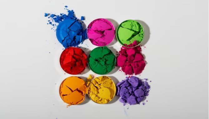
3. Decoding the Impact of Different Colors
Red: Energy and Focus
Red is a color that exudes energy and focus. It’s often used to grab attention and create a sense of urgency. This makes it ideal for call-to-action buttons, sale announcements, or any element on a website where immediate attention is desired. However, overuse of red can be overwhelming, so it should be used strategically to avoid causing a sense of anxiety or alarm.
Orange: Playfulness
Orange combines the energy of red with the cheerfulness of yellow, resulting in a hue that radiates playfulness and creativity. It’s often seen in designs that aim to appear friendly and inviting. Websites targeting a young audience or promoting creative services can benefit from the use of orange to convey a sense of fun and enthusiasm.
Yellow: Optimism
Yellow, the color of sunshine, is associated with happiness, optimism, and warmth. It can be used to create a welcoming and energetic environment on a website. However, it’s a bright color that can be overpowering if used in large quantities, so it should be used sparingly, perhaps to highlight important information or to bring a sense of positivity.
Blue: Trust and Assurance
Blue is often associated with trust, assurance, and professionalism. It’s a preferred choice for corporate, financial, and healthcare websites, where trust is paramount. Different shades of blue can convey different vibes; for instance, a light blue can feel refreshing and calm, while a darker blue can project security and strength.
Green: Prosperity and Renewal
Green, the color of nature, symbolizes growth, renewal, and prosperity. It’s often used in websites related to health, sustainability, and outdoor activities. Lighter greens are seen as calming and reassuring, while darker greens are associated with wealth and prestige.
Black: Intrigue and Sophistication
Black is a color of intrigue and sophistication. It can convey elegance and formality, making it a popular choice for luxury brands, high-end fashion websites, and art galleries. When used effectively, black can create a powerful and stylish visual impact, but it needs to be balanced with other colors to avoid a heavy or oppressive feel.
4. Strategic Placement of Colors on Your Website
The strategic placement of colors on a website is crucial for directing user attention and facilitating easy navigation. Colors can be used to differentiate sections, highlight key information, and guide the user’s eye through the website. For instance, a contrasting color for a call-to-action button against a neutral background can make it stand out and increase click-through rates. Similarly, using color to distinguish between different types of content can help users find what they are looking for more easily. The balance of colors is important; too much color can be distracting, while too little may fail to engage the user effectively.
5. Aligning Website Colors with Brand Identity
The color choices on a website should be a reflection of the brand’s values and identity. Consistent use of brand colors across all platforms and media helps in building brand recognition and loyalty. For instance, a brand that values innovation and energy might lean towards vibrant colors like red and orange, while one that wants to convey reliability and trust might choose blue tones. It’s important to understand the emotions and messages that different colors convey to ensure they align with the brand’s message and audience expectations. This alignment helps in creating a cohesive and effective brand identity that resonates with the target audience.
6. Navigating Cultural Variations in Color Perceptions
Cultural differences play a significant role in how colors are perceived and interpreted. What is considered appealing or appropriate in one culture may have a different connotation in another. For example, while white is often associated with purity and peace in Western cultures, it can be a symbol of mourning in some Eastern cultures. Similarly, red, which is seen as a color of luck and prosperity in China, may be associated with danger or warning in Western countries. Understanding these cultural nuances is crucial for websites targeting a global audience. It’s important to research and consider the cultural context of the target market to ensure that the color scheme of the website resonates positively and is culturally appropriate.
7. Understanding Your Audience Through Color Preferences
Tailoring website color schemes to target demographics involves understanding the preferences and expectations of the audience. Different age groups, genders, and cultures may have varying responses to color. For instance, younger audiences might respond better to bright and vibrant colors, while an older demographic might prefer more subdued tones. Gender can also play a role; some research suggests that certain colors may be more appealing to women than men, and vice versa. Analyzing the audience’s profile – their interests, lifestyle, and cultural background – can provide valuable insights into which colors might be most effective in engaging them.
8. Innovative Applications of Color Psychology in Web Design
Creative use of color in web design can enhance user experience and engagement. For example, gradient color schemes, where colors gradually blend into each other, can create a modern and dynamic look. Using unexpected color combinations or bold contrasts can catch the user’s attention and make a website stand out. Interactive elements like hover effects, which change color when the cursor moves over them, add an element of surprise and engagement. Another innovative application is the use of color to create a mood or atmosphere that aligns with the content, such as using cool, dark colors for a website about space exploration.
9. Key Factors Influencing Color Selection for Websites
Several key factors influence the selection of colors for a website. Industry trends often play a role; certain colors or palettes may become popular within specific sectors. For instance, tech companies might lean towards blue to convey trust and reliability. The target audience’s preferences and cultural background are also crucial factors. Additionally, the brand identity should be a guiding factor in color selection. The colors should align with the brand’s personality, values, and messaging to ensure consistency and recognizability.
10. How Colors Shape User Perception and Website Conversions
Color choices can significantly influence user behavior and conversion rates on a website. Certain colors can trigger emotional responses and actions. For example, red is often used for call-to-action buttons because it creates a sense of urgency and importance. Green, being associated with positivity and agreement, is frequently used for “yes” or “confirm” buttons. The right color scheme can enhance user experience, make a website more memorable, and thereby increase the likelihood of conversions. It’s important to test different colors and analyze their impact on user behavior and conversion rates to understand what works best for the specific audience and objectives of the website.
11. Considering Your Target Market in Color Choices
When selecting colors for a website, it’s crucial to consider the preferences and expectations of the target market. Different market segments may respond differently to various color schemes. For example, a website targeting a corporate audience might opt for a palette of blues and grays to convey professionalism, whereas a site aimed at children might use a range of bright and playful colors. Understanding the psychographics and demographics of the target market – including age, gender, cultural background, and interests – is key to choosing colors that will resonate with them and encourage engagement.
12. Matching Website Themes with Appropriate Colors
Selecting colors that complement the overall theme of a website ensures a cohesive and harmonious user experience. If the website is centered around nature, for instance, shades of green, brown, and blue might be most appropriate. For a tech-focused site, sleek and modern colors like blue, black, and silver can convey a sense of innovation. It’s important to consider the emotional message the website aims to communicate and select colors that support and enhance that message.
13. Optimal Colors for Website Backgrounds and Elements
Backgrounds: Setting the Tone
The background color of a website sets the foundational tone. Neutral colors like white, gray, or beige are commonly used as they provide a clean backdrop that allows content to stand out. Darker backgrounds can create a bold and sophisticated look but may require careful balancing with text and elements to ensure readability.
Call-to-Action Buttons: Driving User Action
The color of call-to-action (CTA) buttons is critical as it needs to grab the user’s attention. Bright colors like red, orange, or green can be effective, depending on the website’s overall color scheme. The key is to use a color that contrasts with the background to make the CTA stand out.
Navigation: Enhancing User Experience
The navigation elements should be easily identifiable. Using a distinct color for these elements can help users navigate the site more intuitively. Consistency in color for all navigation elements is also important for a cohesive look and feel.
14. Embracing Simplicity in Color Schemes
Minimalistic color schemes can be highly effective, offering a clean and modern aesthetic. Such schemes typically use a limited color palette and rely on shades, tints, and textures for variation. This approach can help focus the user’s attention on key content and reduce visual clutter. Minimalist color schemes often translate to better user experiences, especially on mobile devices where screen space is limited.
15. Ensuring Color Accessibility on Websites
Color accessibility is crucial to ensure that all users, including those with visual impairments, can effectively navigate and interact with a website. This involves choosing color combinations that provide sufficient contrast, especially for text and critical interactive elements. Tools like color contrast analyzers can help in assessing the accessibility of a color scheme. Additionally, it’s important to not rely solely on color to convey information; other indicators like text labels or patterns can be used to ensure that information is accessible to everyone.
16. Experimenting with Color Variations: A/B Testing
A/B testing, or split testing, is a valuable method for determining the most effective color schemes for a website. This process involves creating two versions of a web page – each with a different color scheme – and then comparing their performance in terms of user engagement and conversion rates. For example, a website could test two different colors for a call-to-action button to see which one results in more clicks. By analyzing the data collected from these tests, website owners can make informed decisions about which colors resonate best with their audience and optimize their site accordingly. A/B testing allows for a data-driven approach to design, reducing the guesswork involved in selecting colors.
17. Subjectivity in Color Preferences
It’s important to acknowledge the subjectivity inherent in color perception and preferences. Individual experiences, cultural backgrounds, and personal tastes can all influence how a color is perceived and whether it is liked or disliked. This diversity means that while certain generalizations about color psychology can be useful, they are not universally applicable to every user. As a result, website designers need to be flexible and open to adapting their color choices based on feedback and user data.
Conclusion: Summarizing the Role of Color in Web Conversions
In conclusion, the role of color in web design, particularly in relation to user engagement and conversion, cannot be overstated. Color has the power to influence mood, evoke emotions, and guide user behavior, making it a crucial element in creating an effective online presence. The strategic use of color can enhance brand identity, improve user experience, and ultimately drive conversions. However, it’s important to consider cultural variations, personal preferences, and the accessibility needs of all users when choosing a color scheme. Through methods like A/B testing, web designers can fine-tune their color choices to better align with their target audience. In sum, a well-thought-out color strategy is key to attracting and retaining website followers and achieving online success.

As a seasoned professional with a unique blend of skills in Computer Design and Digital Marketing, I bring a comprehensive perspective to the digital landscape. Holding degrees in both Computer Science and Marketing, I excel in creating visually appealing and user-friendly designs while strategically promoting them in the digital world.